Reviewing the first volume in lieu of the whole series. This is my review for the whole series.
I really liked it. I should definitely take more time to individually review each volume, because I feel differently about each one. For starters, the first volume I would probably give 5 stars. I loved it. I felt less strongly about the later volumes. Kinda feels like Matsumoto was losing steam, or maybe even rushing to get the art finished. This is mostly evident to me in the scratchier visual style late in the story.
Let's talk style.
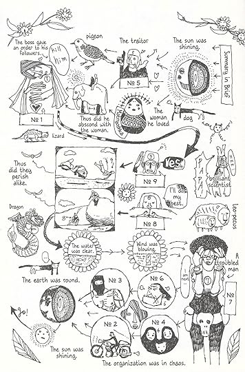
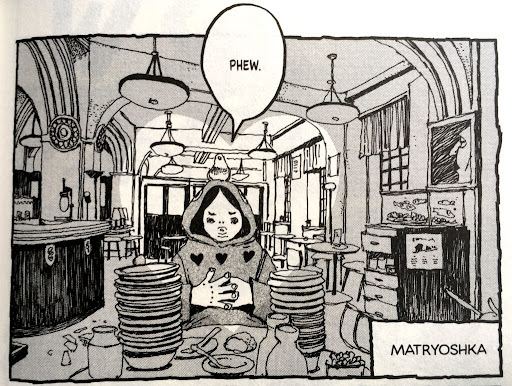
The Moebius influence is crazy. It's somehow more Moebius than Moebius himself. Very trippy. Nature. Desert landscapes. Everything feels so cool. Important moments are juxtaposed with sequences of panels dedicated to shots of nature, animals, scenes from the planet. The costumes / outfits are exquisite. In Moebius fashion, the vehicles and tech all retain this fun, child-like, retro-futurism that I absolutely loved. God, could you imagine how incredible this series would look if they did a full-color version. Ugh. I'm not trying to say Matsumoto is biting Moebius here. He is definitely taking his style, both visually and conceptually (world building, themes of nature, innocence), but then building off it. Especially in the later volumes, Matsumoto jumps between visual styles, contrasting the smooth Moebius aesthetic with scratchy line work, sometimes even giving the reader a little taste of the heta-uma ("bad but good") style which I love so much. This jumping around mostly feels like a tasteful flex of Matsumoto's mastery of the pen, but it works to convey the feeling/emotion of a given moment in the story. Like I mentioned above, the later entries in the series lean heavily towards a scratchy style which I had a hard time appreciating. These parts felt rushed, but can maybe be explained as a visual representation of the more serious and violent tone of the story near the end of the series. Matsumoto definitely plays with styles to convey the emotion / feeling of a particular panel, and these scratchier panels are juxtaposed with a cute, early Osamu Tezuka style seemingly to contrast the ugliness of war and violence, and the heroics and purity of TV wartime propaganda. It still feels rushed. It's hard to make out what's going on in many panels done in this scratchy style. I don't love it.
Plot-wise, this story is cool. I'm kind of a sucker for the whole man-turns-against-the-systems-of-power-to-protect-what-he-loves trope. Most people do, I think. John Wick is crazy popular. Everyone loves a good underdog story. It's a bit cringe-anime, magical-crystal-to-save-the-world type-shit, but I liked it. I loved the pacing. I loved how the reader (me) is left in these cliffhangers where something important happens and then we're treated to a lengthy flashback sequence which fills in the gaps in the story. I thought the recurring theme of shared empathy to be very cool and powerful. Those most attuned to this empathy are the super soldiers of the Rainbow Council and... children. All children are heavily attuned to this empathy, something they seemingly lose as they grow older. I thought the themes of love, fraternity, paternity, and how they're all warped and twisted by human intention/desire/ambition were well developed and universally relevant. This story gets kinda fucked up as the series progresses, I liked that.
Wrap up.
Very cool. Very sick. Incredible artwork. I started this review by giving it 4 stars, but writing this and flipping through the series for writing prompts has me excited again, so I'm bumping it up to 5 stars. Fuck it. Matsumoto is a master illustrator, and a strong writer with a clear, consistent vision. More Moebius than Moebius himself.